OUTDATED & MISUNDERSTOOD
Agency: Out of the Square Media
Challenge
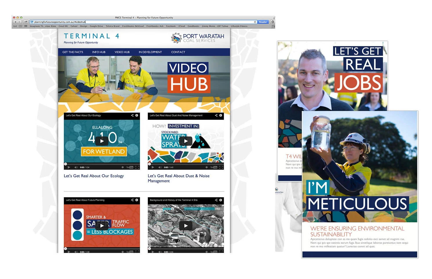
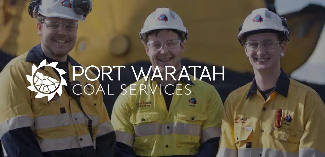
Port Waratah Coal Services (PWCS) is one of the largest coal export handlers in the Southern Hemisphere, with highly visible operations in the Port of Newcastle. For decades they flew under the radar with locals not even being aware of what they did day to day. With ever increasing public awareness and media scrutiny, due to business development initiatives, and an internally disengaged workforce, PWCS felt that it was time to more actively engage with their staff, local community, government and the media. For this step change, it was determined that a multi-faceted rebrand was required which included the development of a Positioning and Brand Strategy, positioning line, new brand identity with associated collateral templates, Communications Plan, and a brand campaign.
Project input
Creative Lead for development of Brand and Positioning Strategy and Brand Communications Plan
Facilitator at Brand Workshops Series with stakeholders and management
Art Director and designer of new brand logo and visual identity
Concepting and art direction for ‘It’s Who We Are’ Brand Campaign and Terminal 4 Education Campaign
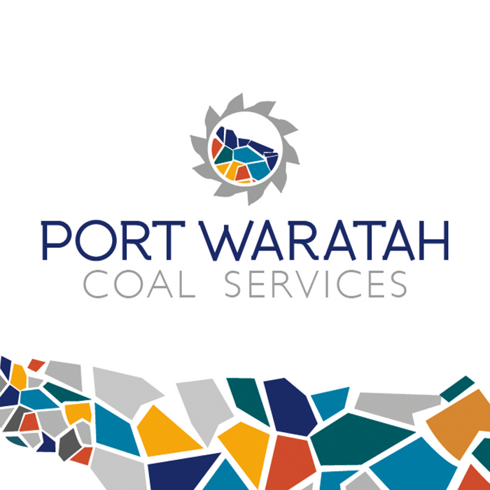
INDENTITY RATIONALE
The coal loader bucket wheel was used to visually represent the business as – it’s always turning and an easily identifiable part of Port Waratah. Most importantly, it helped people understand what they do in the coal chain, that they are not mining coal; nor are they buying coal. They simply move it from one point to the next.
Inside it are the mutli-coloured coal shapes symbolising the many different stakeholders they work with and support. The colours are inspired by site-machinery, housing and safety colourings. The shapes are to reflect a vibrant, diverse and the desire for Port Waratah Coal Services to be an approachable brand.